Mastering CSS Grid Layout: A Comprehensive Guide for Modern Web Design

Anúncios
In the ever-evolving landscape of web development, creating robust, flexible, and responsive layouts is paramount. Gone are the days of relying solely on floats, tables, or complex positioning hacks to achieve desired designs. Enter CSS Grid Layout, a two-dimensional layout system that has revolutionized how developers approach web design. With its powerful capabilities, CSS Grid allows you to define both rows and columns, providing unparalleled control over the placement and alignment of elements on a webpage. This comprehensive guide will delve deep into the world of CSS Grid, equipping you with the knowledge and skills to master this essential tool for modern web development.
What is CSS Grid Layout?
At its core, CSS Grid Layout is a CSS module that offers a grid-based layout system, designed for laying out items into rows and columns. Unlike Flexbox, which is primarily a one-dimensional layout system (either rows or columns), CSS Grid excels at two-dimensional layouts, making it perfect for designing entire pages or significant sections of a page. Think of it as a spreadsheet for your HTML elements, where you can precisely define the structure and then place your content within that structure.
The Fundamental Concepts of CSS Grid
Before we dive into practical examples, understanding the core terminology is crucial:
- Grid Container: This is the parent element on which
display: grid;ordisplay: inline-grid;is applied. All direct children of the grid container become grid items. - Grid Item: The direct children of the grid container. These are the elements that are laid out within the grid.
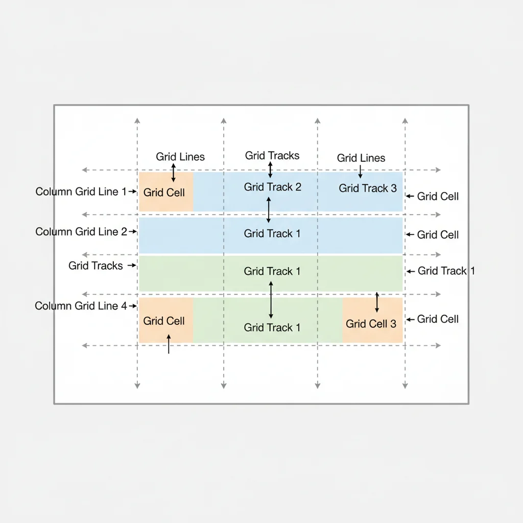
- Grid Line: The dividing lines that make up the structure of the grid. They can be vertical (column grid lines) or horizontal (row grid lines).
- Grid Track: The space between two adjacent grid lines. This can be a row track (horizontal) or a column track (vertical).
- Grid Cell: The intersection of a grid row and a grid column. This is the smallest unit of the grid, similar to a cell in a table.
- Grid Area: A rectangular space on the grid defined by four grid lines (two row lines and two column lines). A grid item can span across multiple grid cells to form a grid area.
Understanding these concepts is the first step towards effectively utilizing CSS Grid Layout for your web projects. It provides a clear mental model for how elements will interact and position themselves within your defined grid.
Getting Started with Basic CSS Grid
Implementing CSS Grid Layout begins with defining a grid container. Let’s look at a basic example:
<div class="container">
  <div class="item">1</div>
  <div class="item">2</div>
  <div class="item">3</div>
  <div class="item">4</div>
</div>
.container {
display: grid;
grid-template-columns: 100px 100px 100px;
grid-template-rows: 50px 50px;
gap: 10px;
}
In this simple setup:
display: grid;transforms the.containerinto a grid container.grid-template-columns: 100px 100px 100px;creates three columns, each 100px wide.grid-template-rows: 50px 50px;creates two rows, each 50px high.gap: 10px;(shorthand forgrid-row-gapandgrid-column-gap) adds 10px of space between grid tracks.
The grid items will automatically flow into the defined grid cells. This foundational understanding is key to unlocking more complex layouts with CSS Grid Layout.
Advanced Grid Properties and Techniques
While basic column and row definitions are a great start, CSS Grid Layout offers a plethora of properties for fine-tuning your designs.
Flexible Units with fr
The fr unit (fractional unit) is a powerful feature unique to CSS Grid. It allows you to distribute available space among grid tracks proportionally. For instance:
.container {
  display: grid;
  grid-template-columns: 1fr 2fr 1fr;
}
This creates three columns where the middle column takes up twice as much space as the first and third columns. This flexibility is invaluable for responsive design, as the columns will adjust their widths based on the container’s size. When working with CSS Grid Layout, the fr unit quickly becomes indispensable.
Repeating Tracks with repeat()
For grids with many identical tracks, the repeat() function simplifies your CSS:
.container {
  display: grid;
  grid-template-columns: repeat(4, 1fr);
  grid-template-rows: repeat(2, 100px);
}
This creates a grid with four equal-width columns and two 100px high rows. You can also mix fixed and flexible units within repeat() or combine it with other track definitions.
Automatic Placement with auto-fill and auto-fit
These keywords, used with repeat(), are crucial for creating truly responsive grids that adapt to available space:
auto-fill: Creates as many columns (or rows) as possible without overflowing the container, even if there aren’t enough grid items to fill them.auto-fit: Similar toauto-fill, but if there are fewer grid items than potential tracks, the empty tracks collapse, allowing the items to expand and fill the available space.
.container {
  display: grid;
  grid-template-columns: repeat(auto-fill, minmax(200px, 1fr));
}
This snippet creates columns that are at least 200px wide, but will grow to fill the available space, creating as many columns as can fit. This is a powerful pattern for image galleries or card layouts where the number of items might vary. It’s a cornerstone for flexible CSS Grid Layout designs.
Placing Items on the Grid
Once your grid structure is defined, you need to place your grid items. CSS Grid Layout offers several ways to do this, ranging from automatic placement to explicit positioning.
Explicit Placement with Line Numbers
Every grid line is implicitly numbered, starting from 1. You can use these numbers to explicitly position items:
.item-a {
  grid-column-start: 1;
  grid-column-end: 3;
  grid-row-start: 1;
  grid-row-end: 2;
}
This places .item-a starting at column line 1 and ending before column line 3 (spanning two columns), and starting at row line 1 and ending before row line 2 (spanning one row). Shorthand properties like grid-column: 1 / 3; and grid-row: 1 / 2; make this more concise. Even further, grid-area: 1 / 1 / 2 / 3; (row-start / column-start / row-end / column-end) can define the entire area.
Placement with Named Grid Lines
For more readable and maintainable code, especially in complex layouts, you can name your grid lines:
.container {
  display: grid;
  grid-template-columns: [main-start] 1fr [content-start] 2fr [content-end] 1fr [main-end];
  grid-template-rows: [header-start] auto [header-end nav-start] auto [nav-end content-start] 1fr [content-end footer-start] auto [footer-end];
}

.header {
  grid-column: main-start / main-end;
  grid-row: header-start / header-end;
}

.nav {
  grid-column: main-start / content-start;
  grid-row: nav-start / nav-end;
}

.content {
  grid-column: content-start / content-end;
  grid-row: content-start / content-end;
}
Named lines significantly improve the clarity of your layout definitions, making them easier to understand and adjust. This approach is highly recommended for larger projects built with CSS Grid Layout.
Placement with Grid Areas
Perhaps the most intuitive way to define complex layouts with CSS Grid Layout is using grid-template-areas. This property allows you to visually construct your layout in your CSS:
.container {
  display: grid;
  grid-template-columns: 1fr 2fr 1fr;
  grid-template-rows: auto 1fr auto;
  grid-template-areas:
    "header header header"
    "nav    content sidebar"
    "footer footer footer";
}

.header  { grid-area: header; }
.nav     { grid-area: nav; }
.content { grid-area: content; }
.sidebar { grid-area: sidebar; }
.footer  { grid-area: footer; }
Each string represents a row, and the words within the string represent the named areas spanning columns. Identical names create a single contiguous grid area. This method is incredibly powerful for rapidly prototyping and visualizing your layout structure, especially when designing responsive layouts where areas might shift. Mastering grid areas is a hallmark of proficiency in CSS Grid Layout.
Alignment and Justification in CSS Grid
Just like Flexbox, CSS Grid offers robust alignment and justification properties to control how items are positioned within their grid cells or tracks.
Aligning Grid Items
justify-items: Aligns grid items along the inline (row) axis within their cells. Values includestart,end,center,stretch(default). Applied to the grid container.align-items: Aligns grid items along the block (column) axis within their cells. Values includestart,end,center,stretch(default). Applied to the grid container.justify-self: Aligns a single grid item along the inline (row) axis within its cell. Applied to individual grid items.align-self: Aligns a single grid item along the block (column) axis within its cell. Applied to individual grid items.
.container {
  display: grid;
  justify-items: center; /* All items centered horizontally */
  align-items: start;    /* All items aligned to the top vertically */
}

.item-b {
  justify-self: end;    /* Override for specific item: align to the right */
  align-self: center;   /* Override for specific item: center vertically */
}
Aligning Grid Tracks
When the total size of your grid tracks is less than the size of the grid container, you can align the tracks themselves:
justify-content: Aligns the grid tracks along the inline (row) axis. Values includestart,end,center,space-around,space-between,space-evenly. Applied to the grid container.align-content: Aligns the grid tracks along the block (column) axis. Values includestart,end,center,space-around,space-between,space-evenly. Applied to the grid container.
These properties provide granular control over the distribution of space within your CSS Grid Layout, ensuring your designs look polished and professional.
Responsive Design with CSS Grid
One of the most compelling reasons to adopt CSS Grid Layout is its inherent power for responsive design. Combining grid properties with media queries allows you to completely transform your layout based on screen size, without altering your HTML structure.
Changing Grid Templates with Media Queries
Consider a typical header, content, sidebar, and footer layout. On desktop, you might want a multi-column layout, but on mobile, a single-column stack. CSS Grid makes this incredibly straightforward:
.container {
  display: grid;
  grid-template-columns: 1fr;
  grid-template-rows: auto 1fr auto auto;
  grid-template-areas:
    "header"
    "content"
    "sidebar"
    "footer";
}

@media (min-width: 768px) {
  .container {
    grid-template-columns: 1fr 3fr 1fr;
    grid-template-rows: auto 1fr auto;
    grid-template-areas:
      "header  header  header"
      "nav     content sidebar"
      "footer  footer  footer";
  }
}

@media (min-width: 1024px) {
  .container {
    grid-template-columns: 200px 1fr 250px;
    grid-template-rows: auto 1fr auto;
    grid-template-areas:
      "header  header  header"
      "nav     content sidebar"
      "footer  footer  footer";
  }
}
In this example, the layout starts as a single column for smaller screens. As the viewport widens, media queries kick in to redefine grid-template-columns, grid-template-rows, and grid-template-areas, creating a more complex, multi-column layout. This declarative approach to responsive design is a significant advantage of CSS Grid Layout.

Minmax() and Auto-Fit/Auto-Fill for Fluid Grids
As mentioned earlier, minmax() combined with auto-fit or auto-fill creates highly flexible and dynamic grids that automatically adjust the number of columns based on available space:
.gallery {
  display: grid;
  grid-template-columns: repeat(auto-fit, minmax(250px, 1fr));
  gap: 20px;
}
This code will create a gallery where each item is at least 250px wide. The grid will automatically fit as many 250px columns as possible, and if there’s extra space, the columns will expand proportionally. If the screen is too small for multiple 250px columns, it will gracefully fall back to a single column. This is a brilliant way to handle image grids, product listings, or any collection of items where the exact number of columns isn’t fixed. This technique truly exemplifies the power of CSS Grid Layout for modern, fluid web experiences.
Browser Support and Fallbacks
CSS Grid Layout enjoys excellent browser support across all modern browsers (Chrome, Firefox, Edge, Safari, Opera). For older browsers that don’t support Grid, you can implement fallbacks using feature queries (@supports) or by designing a basic layout with Flexbox or floats first, and then enhancing it with Grid for supporting browsers.
.container {
  display: flex; /* Fallback for older browsers */
  flex-wrap: wrap;
}

@supports (display: grid) {
  .container {
    display: grid;
    grid-template-columns: repeat(auto-fit, minmax(250px, 1fr));
    gap: 20px;
  }
}
This approach ensures that users on older browsers still get a usable (though perhaps less optimized) layout, while users on modern browsers benefit from the full power of CSS Grid Layout.
Common Use Cases for CSS Grid
The versatility of CSS Grid Layout makes it suitable for a wide array of web design challenges:
- Entire Page Layouts: Creating complex main layouts with headers, footers, sidebars, and content areas.
- Component Layouts: Designing individual components like cards, dashboards, or image galleries.
- Form Layouts: Aligning form fields and labels precisely.
- Responsive Grids: Building layouts that adapt seamlessly to various screen sizes and orientations.
- Overlapping Elements: Positioning elements to overlap using line-based placement.
- Holy Grail Layout: Easily creating the classic three-column layout with a header and footer that stretch across the page.
- Dashboard Interfaces: Constructing complex, data-rich dashboards with varying widget sizes and positions.
- Magazine-style Layouts: Achieving intricate, asymmetrical designs often seen in print media, with precise control over content flow.
- Image Galleries: Dynamically arranging images of different sizes in a visually appealing grid.
- Product Listings: Creating flexible e-commerce product grids that adapt to different screen sizes and product information.
Each of these scenarios benefits immensely from the two-dimensional control offered by CSS Grid Layout, simplifying development and improving maintainability.
Best Practices and Tips for Using CSS Grid
- Start with Mobile First: Design your simplest layout for mobile devices, then use media queries to enhance it for larger screens using more complex grid structures.
- Use Named Grid Areas: For complex layouts,
grid-template-areasmakes your CSS much more readable and maintainable. - Embrace
frUnits: Leverage fractional units for flexible and responsive track sizing. - Combine with Flexbox: Remember that Grid is for two-dimensional layouts, while Flexbox is excellent for one-dimensional alignment within a grid cell or a smaller component. They complement each other perfectly.
- Inspect with Developer Tools: Modern browser developer tools offer excellent CSS Grid inspectors that visualize your grid lines and areas, making debugging and understanding your layout much easier.
- Avoid Over-nesting Grids: While possible, excessive nesting of grids can sometimes make layouts harder to manage. Consider if a sub-component truly needs its own grid or if Flexbox would suffice.
- Accessibility: Ensure that the visual order of your grid items matches the logical order in your HTML for users relying on screen readers or keyboard navigation. CSS Grid allows you to visually reorder items, but this doesn’t change the source order.
- Plan Your Layout: Before writing any CSS, sketch out your desired grid structure. This pre-planning can save significant time and effort.
Conclusion: Embracing CSS Grid for Future-Proof Web Design
CSS Grid Layout is undoubtedly one of the most significant advancements in CSS for layout design. Its ability to handle complex, two-dimensional structures with remarkable flexibility and responsiveness makes it an indispensable tool for any modern web developer. By understanding its fundamental concepts, mastering its advanced properties, and applying best practices, you can create stunning, maintainable, and highly adaptive web interfaces that stand the test of time.
Whether you’re building a simple component or an entire website, integrating CSS Grid Layout into your workflow will streamline your development process and elevate the quality of your designs. Start experimenting with it today, and you’ll quickly discover the immense power and elegance it brings to the table. The future of web layout is here, and it’s built on the grid.
